
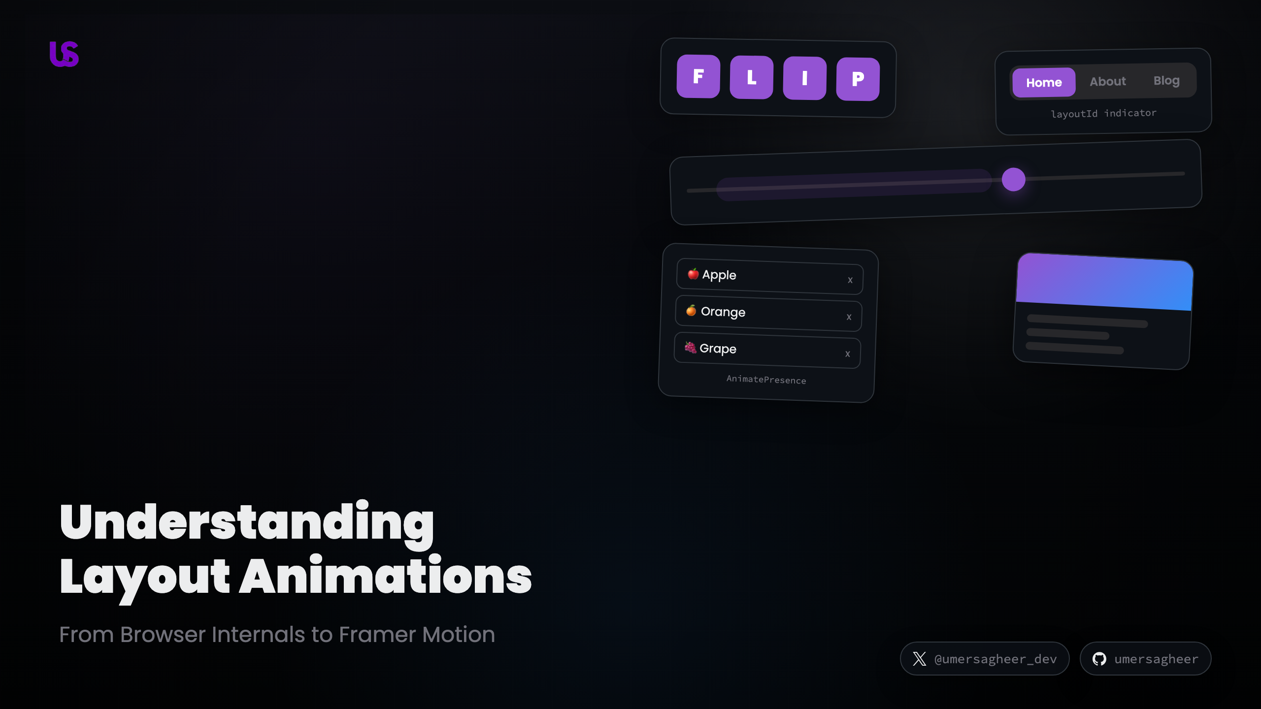
Understanding Layout Animations: From Browser Internals to Framer Motion
Have you ever tried animating an element's width or height and noticed it felt... off? Maybe it stuttered on your phone, or the whole page seemed to lag. You're not imagining it — there's a fundamental reason why some animations are smooth and others aren't.
In this post, we'll start from scratch and build up to understanding layout animations — one of the most powerful patterns in modern UI development. Along the way, you'll get to play with interactive demos that show exactly what's happening under the hood.
The Problem With Layout Animations
Let's start with a simple question: what happens when you animate the width of
a box?
.box {
  width: 60px;
  transition: width 0.3s ease;
}
.box.expanded {
  width: 100%;
}
It works! The box smoothly grows. But there's a hidden cost.
Every time the browser renders a frame, it goes through a rendering pipeline:
- Style — figure out which CSS rules apply
- Layout — calculate the position and size of every element
- Paint — fill in the pixels (colors, borders, shadows)
- Composite — layer everything together and display it
When you animate width, height, top, or left, you're forcing the browser
to redo step 2 — Layout — on every single frame. That means recalculating
the position of the animated element and every sibling around it, 60 times per
second.
On a powerful laptop, you might not notice. On a phone? Dropped frames, jank, and frustrated users.
The Safe Properties
There are only two CSS properties that skip straight to the Composite step:
transform— move, scale, rotateopacity— fade in/out
These are GPU-accelerated. The browser hands them off to the graphics card, which is extremely good at this kind of work. No layout recalculation, no repainting — just fast, smooth compositing.
But here's the catch: transform: scale(2) makes an element look bigger, but
it doesn't actually change the layout. Sibling elements don't move out of the
way. It's a visual trick, not a real size change.
Toggle the demo below to see this in action. On the left, transform: scaleX(2)
makes the middle box overlap its neighbors. On the right, changing the actual
width pushes them aside — but triggers an expensive layout recalculation.
Transform doesn't affect layout — it just paints on top
Using transform
Middle box at normal size
Using width
Middle box at normal size
So how do we get the best of both worlds — real layout changes that animate with GPU-accelerated transforms?
See It In Action
Toggle the demo below and watch the difference. The left box just snaps to its
new size. The right box uses Framer Motion's layout prop to animate smoothly
using transforms:
Toggle between states to see the difference
Without animation
With layout prop
The right side looks effortless, right? Under the hood, it's using a clever technique called FLIP.
The FLIP Technique
FLIP stands for First, Last, Invert, Play. It was coined by Paul Lewis at Google, and it's the secret sauce behind every smooth layout animation you've ever seen.
The core idea is beautifully simple:
Let the browser do the layout change instantly. Then use transforms to fake a smooth animation.
Here's how it works, step by step:
Step through the FLIP technique
Let's break each step down:
First
Before anything changes, measure the element's current position using
getBoundingClientRect(). Record the x, y, width, and height.
Last
Apply the layout change (toggle a class, update state, whatever). The element instantly jumps to its new position. Measure it again.
Invert
Calculate the difference between the two positions. Apply a transform to make
the element look like it's still at the starting position. Visually, nothing
has changed — but the element is actually already at its final spot in the DOM.
Play
Remove the transform over time (animate it back to zero). The element smoothly glides from where it appeared to be, to where it actually is.
The beauty of this approach is that the actual animation only uses transform —
which is GPU-accelerated and doesn't trigger layout recalculation.
The 100ms Window
There's a neat perceptual trick at play here. Research shows that users don't notice any delay under 100 milliseconds. The FLIP technique exploits this: all the measuring and calculating happens in that imperceptible window right after the user interacts. By the time they expect to see movement, the smooth transform animation is already playing.
Framer Motion's layout Prop
"Cool technique," you might be thinking, "but do I really have to write all that
getBoundingClientRect code myself?"
Nope. Framer Motion does FLIP for you automatically. Just add a single prop:
import { motion } from 'framer-motion'

// This element will automatically animate ANY layout change
;<motion.div layout />
That's it. Any time the element's size or position changes due to a React re-render, Framer Motion will:
- Measure the element before the update
- Let React update the DOM
- Measure the element after the update
- Apply an inverse transform
- Animate the transform to zero using spring physics
It can even animate properties that CSS can't transition at all — like
switching justify-content from flex-start to flex-end. Since FLIP works by
comparing positions (not CSS values), it works with any layout change.
<motion.div
  layout
  style={{
    display: 'flex',
    justifyContent: isToggled ? 'flex-end' : 'flex-start'
  }}
>
  <motion.div layout className='indicator' />
</motion.div>
Shared Layout Animations with layoutId
The layout prop is great for animating a single element. But what about
animating between two different elements?
This is where layoutId gets really interesting. When you give two elements the
same layoutId, Framer Motion treats them as the same element — even if they're
in completely different parts of the React tree.
// In component A
<motion.div layoutId="highlight" className="tab-indicator" />

// In component B (rendered elsewhere)
<motion.div layoutId="highlight" className="active-marker" />
When one appears and the other disappears, Framer Motion morphs between them.
Use the toggle below to compare — without layoutId, the indicator just pops
into place. With it, the indicator slides smoothly:
Click the tabs — watch the indicator morph
Active tab: Home — the indicator smoothly transitions using layoutId
This pattern is everywhere in polished UIs: tab indicators, navigation highlights, cards that expand into modals, and list items that morph between views.
AnimatePresence: Animating Mount & Unmount
There's one thing React is notoriously bad at: exit animations.
When a component unmounts, React removes it from the DOM immediately. Gone. No chance to say goodbye. This makes it impossible to animate an element leaving the screen with plain React.
AnimatePresence solves this. It wraps your children and keeps them in the DOM
long enough for their exit animation to finish:
import { motion, AnimatePresence } from 'framer-motion'

;<AnimatePresence>
  {items.map(item => (
    <motion.div
      key={item.id}
      initial={{ opacity: 0, scale: 0.8 }}
      animate={{ opacity: 1, scale: 1 }}
      exit={{ opacity: 0, scale: 0.8 }}
    >
      {item.label}
    </motion.div>
  ))}
</AnimatePresence>
Three states, three props:
initial— how the element looks before it mountsanimate— how it looks when it's on screenexit— how it should animate out before unmounting
Try adding and removing items below. Toggle between modes to see the difference
— without AnimatePresence, items vanish instantly:
Add and remove items — watch the enter/exit animations
AnimatePresence delays unmounting until the exit animation completes, letting elements animate out gracefully.
The layout prop on each item ensures the remaining items smoothly reflow into
their new positions.
Spring Physics: Why Animations Feel Natural
You might have noticed that the animations in this post feel different from typical CSS transitions. They overshoot slightly, settle naturally, and respond to interrupted changes gracefully.
That's because Framer Motion uses spring physics by default, not duration-based easing curves.
A CSS transition says: "go from A to B in 300 milliseconds." A spring says: "there's a spring connecting you to point B — physics will determine how you get there."
The Three Parameters
Springs in Framer Motion are controlled by three values:
- Stiffness — how taut the spring is. Higher = faster, snappier movement.
- Damping — how much friction resists the motion. Higher = less bounce.
- Mass — how heavy the object feels. Higher = more momentum, slower to start/stop.
Play with the sliders below to feel the difference:
Adjust the spring parameters and hit Play
Quick Rules of Thumb
- Snappy UI feedback (buttons, toggles): high stiffness (400+), high damping (25-30)
- Smooth transitions (modals, page changes): medium stiffness (200-300), medium damping (20-25)
- Playful, bouncy effects: lower damping (10-15), moderate stiffness
- Heavy, deliberate motion: higher mass (1.5+)
The reason springs feel more natural than easing curves is that they respond to velocity. If you interrupt a spring animation mid-flight, it doesn't awkwardly restart — it smoothly changes direction based on its current momentum. Real objects in the real world work the same way.
Real-World Example: The Morphing Dialog
Let's tie everything together with a real-world example. This portfolio site uses a morphing dialog pattern for its project cards. When you click a project card, it expands into a full dialog.
This combines every concept we've covered:
layoutIdon the card and dialog — so they morph into each otherAnimatePresence— so the dialog can animate out when closed- Spring physics — for natural, interruptible transitions
- Multiple
layoutIds — the image, title, and subtitle each have their own, so they independently animate to their new positions
Try it yourself:
Click the card to see it morph into a dialog
Project Card
Click to expand
The card and the dialog are two completely different components. But because
they share layoutId values, Framer Motion connects them and runs the FLIP
technique to morph between the two states.
Here's the simplified pattern:
// The card (collapsed state)
<motion.div layoutId="card" onClick={()=> setOpen(true)}>
  <motion.img layoutId="card-image" />
  <motion.h3 layoutId="card-title">Project</motion.h3>
</motion.div>

// The dialog (expanded state)
<AnimatePresence>
  {isOpen && (
    <motion.div layoutId="card">
      <motion.img layoutId="card-image" />
      <motion.h3 layoutId="card-title">Project</motion.h3>
      <p>Additional content here...</p>
    </motion.div>
  )}
</AnimatePresence>
Each layoutId pair is like a magical thread connecting two DOM nodes. Framer
Motion measures both ends and uses FLIP to create a seamless transition.
Wrapping Up
Layout animations can transform a good UI into a great one. They help users understand spatial relationships, track where elements went, and feel like they're interacting with something tangible rather than a bunch of pixels.
Here's what we covered:
- The problem: Animating layout properties (
width,height,top,left) is expensive because it triggers layout recalculation on every frame - The solution: The FLIP technique — measure, invert with transforms, animate. GPU-accelerated, no layout thrashing
- The abstraction: Framer Motion's
layoutprop does FLIP automatically with one line of code - Shared transitions:
layoutIdconnects elements across the React tree for morphing animations - Exit animations:
AnimatePresencekeeps elements in the DOM for graceful unmount animations - Natural motion: Spring physics feel better than duration-based easing because they respond to velocity
Further Reading
- FLIP Your Animations — Paul Lewis's original FLIP article
- Magic Motion — Nanda Syahrasyad's interactive guide to recreating layout animations
- Framer Motion Layout Animations — Official documentation
- An Interactive Guide to CSS Transitions — Josh Comeau's deep dive into animation fundamentals
- High-Performance Animations — web.dev guide to compositor-friendly animations